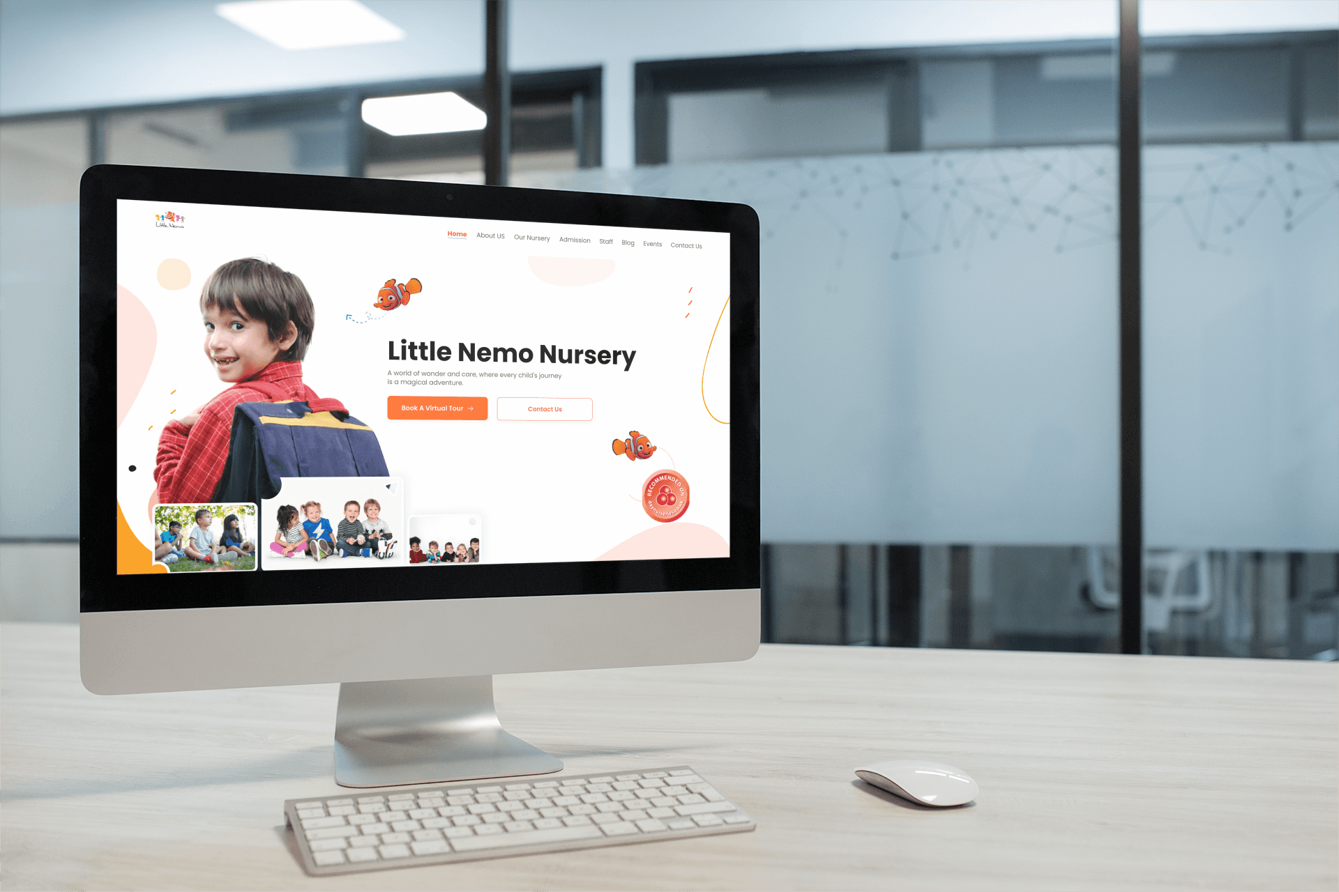
How we redesigned little nemo website, a nursery for children in Tufnell Park Road London, United Kingdom.
How we redesigned little nemo website, a nursery for children in Tufnell Park Road London, United Kingdom.
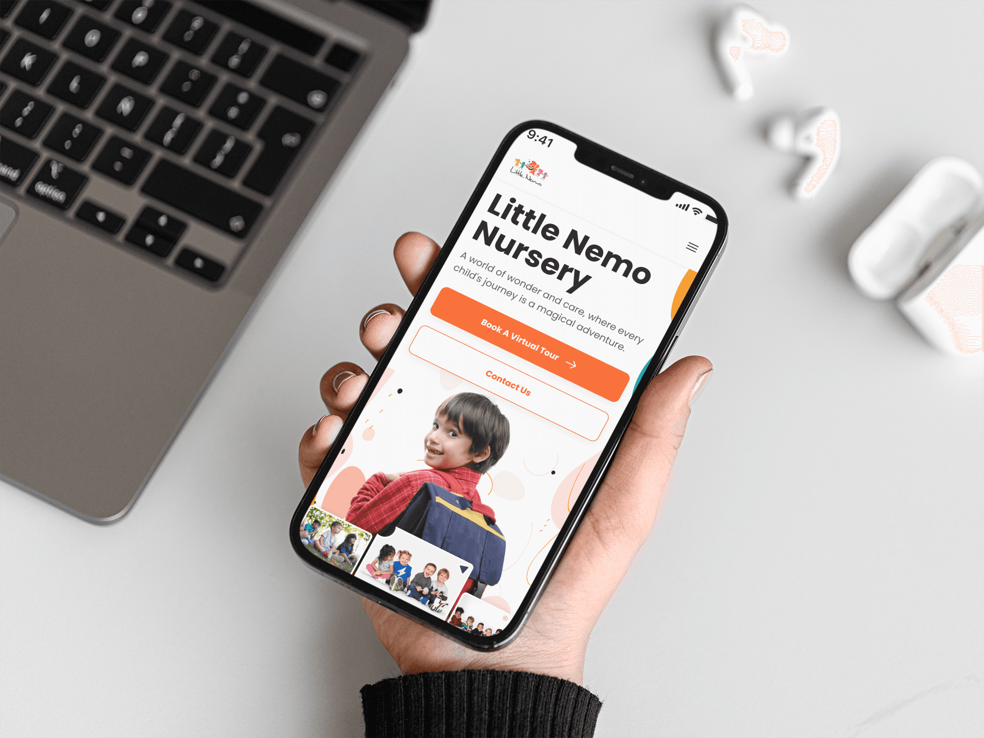
How we redesigned little nemo website, a nursery for children in Tufnell Park Road London, United Kingdom.
How we redesigned little nemo website, a nursery for children in Tufnell Park Road London, United Kingdom.
Project Type
Responsive Web Design
Product Type
Company Website
Project Duration
2 weeks
Client
Little Nemo Nursery
Project Type
Responsive Web Design
Product Type
Business Website
Project Duration
2 weeks
Client
Little Nemo Nursery
Project Brief
Project Brief
Overview:
Little Nemo Nursery, based in House on the Rock, The Rock Tower 49 Tufnell Park Road London, United Kingdom, is seeking a comprehensive redesign of their existing website. The current website's poor design and usability hinders effective communication with parents and potential clients. The aim is to create a visually appealing, user-friendly, and informative website that reflects the nursery's values, services, and commitment to child development.
Goals:
Enhanced User Experience: Craft a user-centric design that provides a seamless and engaging experience for parents, guardians, and prospective clients, enabling easy navigation and access to essential information.
Brand Identity: Establish a strong online presence by aligning the website's visual elements with Little Nemo Nursery's brand identity, fostering recognition and credibility.
Information Accessibility: Ensure that crucial details such as programs, staff, facilities, and enrollment procedures are easily accessible, helping parents make informed decisions about their child's education.
Engagement and Interaction: Implement interactive features that encourage engagement, such as photo galleries, testimonials, and blog posts, to foster a sense of community and trust among visitors.
Responsive Design: Create a responsive website that adapts seamlessly to various devices and screen sizes, catering to busy parents who access the site on smartphones and tablets.
Target Audience
Target Audience
The primary target audience includes parents, guardians, and families residing in London who are actively seeking a reputable nursery for their children. Additionally, the redesign should also cater to potential clients who are researching nurseries and childcare options in the area.
The primary target audience includes parents, guardians, and families residing in London who are actively seeking a reputable nursery for their children. Additionally, the redesign should also cater to potential clients who are researching nurseries and childcare options in the area.
Success Criteria
Success Criteria
Increased Website Traffic: Monitor and analyze website traffic metrics, aiming for a noticeable increase in the number of visitors accessing the website.
Reduced Bounce Rate: Measure the bounce rate to ensure visitors are engaging with the content and exploring multiple pages.
Improved User Engagement: Track user interaction with interactive features (e.g., photo galleries, testimonials) and assess the time spent on the website.
Enhanced Conversion Rate: Monitor inquiries and enrollment requests generated through the website, aiming for an improved conversion rate.
Positive User Feedback: Collect and analyze user feedback to gauge overall satisfaction with the website's design, functionality, and accessibility.
Consistent Branding: Evaluate the alignment of the website's visual design with Little Nemo Nursery's branding guidelines.
Mobile-Friendly Usage: Ensure that the redesigned website receives positive feedback for its mobile-responsive design and usability.
Team Structure
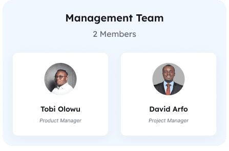
Team Structure

The Challenge
The Challenge
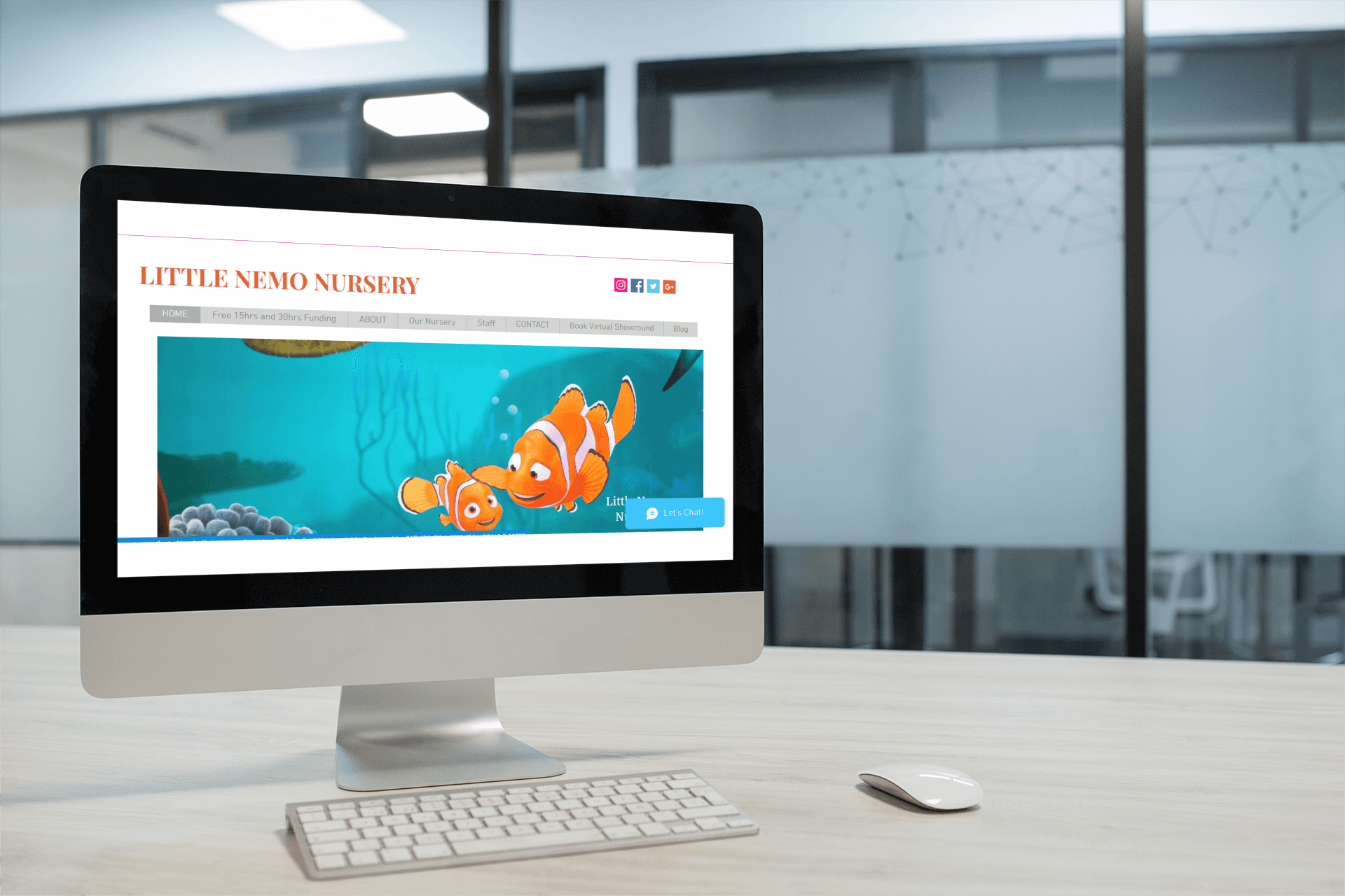
The existing website had several usability and aesthetics issues:
Cluttered Layout: The website's layout appeared cluttered with an overload of information, making it challenging for users to find relevant details quickly.
Inconsistent Navigation: Navigation was inconsistent, with unclear menu labels and illogical grouping of content, leading to confusion and frustration.
Unintuitive Information Architecture: The website lacked a clear and intuitive information hierarchy, causing difficulties in locating important information such as programs and enrollment details.
Poor Visual Hierarchy: The lack of a clear visual hierarchy resulted in important elements such as calls-to-action and program highlights being overshadowed, affecting user engagement.
Outdated Design Elements: Outdated design elements and typography choices detracted from the website's modern appeal and failed to resonate with the target audience.
Lack of Mobile Responsiveness: The website was not mobile-responsive, leading to a subpar experience for users accessing it on smartphones and tablets.
Limited Imagery and Visual Appeal: Sparse use of imagery and lack of visual appeal made the website appear text-heavy and uninviting.
Contrasting Color Choices: Poor color contrast between text and background hindered readability, especially for users with visual impairments.
Missing Call-to-Action: Absence of clear calls-to-action throughout the site made it difficult for users to take desired actions, such as enrolling or contacting the nursery.
Minimal Interactive Elements: The website lacked interactive elements like buttons, sliders, and hover effects, resulting in a static and unengaging experience.
Approach
Approach
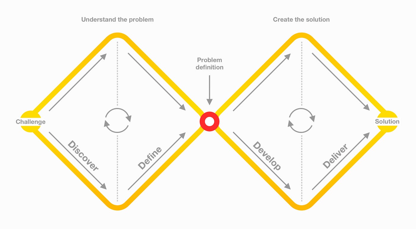
I employed the Double Diamond design process to address the usability and aesthetics issues of the existing Little Nemo Nursery website:
I employed the Double Diamond design process to address the usability and aesthetics issues of the existing Little Nemo Nursery website:
Design Sprint
Design Sprint
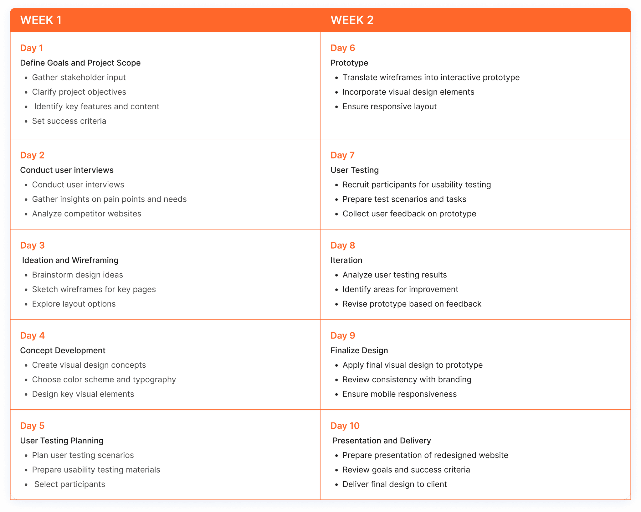
See below the sprint planning activities.
See below the sprint planning activities.
Discover Phase
Discover Phase
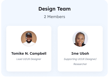
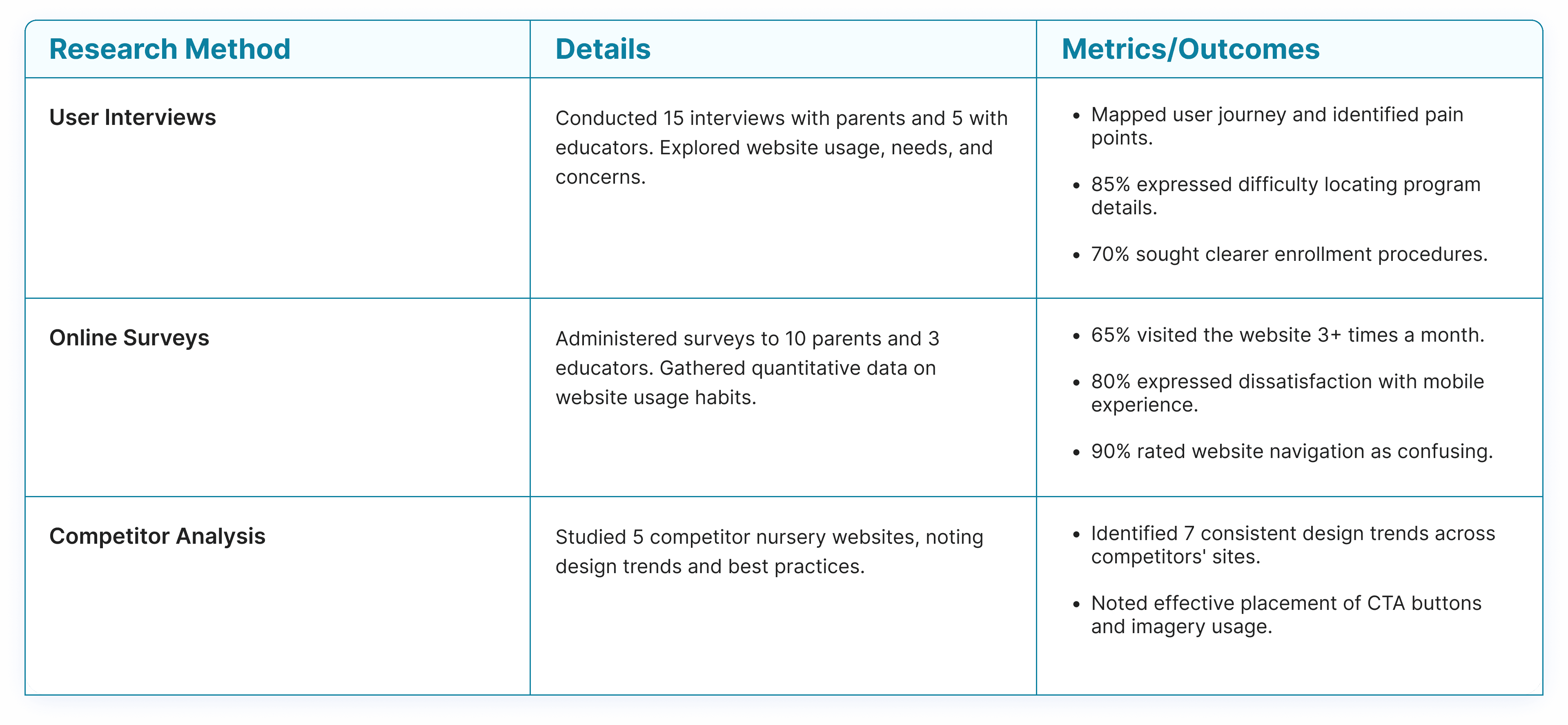
User Research: The supporting designer on this project Ime Uboh conducted interviews and surveys with parents and educators to understand their needs, preferences, and pain points.
Competitive Analysis: We analyzed competitor websites to identify industry best practices and design trends.
User Research: The supporting designer on this project Ime Uboh conducted interviews and surveys with parents and educators to understand their needs, preferences, and pain points.
Competitive Analysis: We analyzed competitor websites to identify industry best practices and design trends.
Define Phase
Define Phase
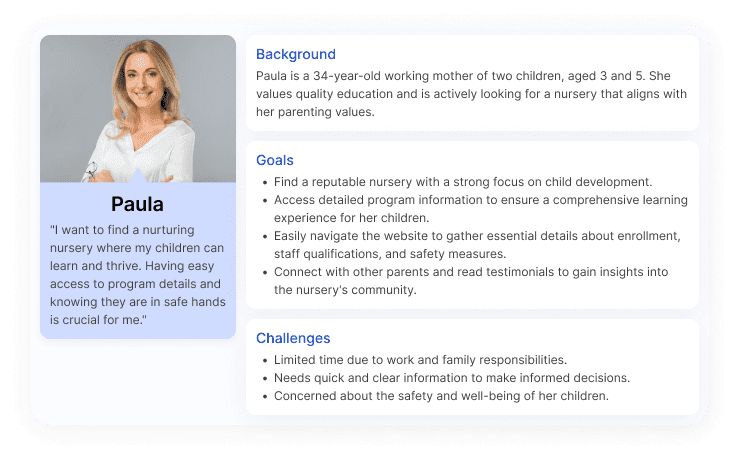
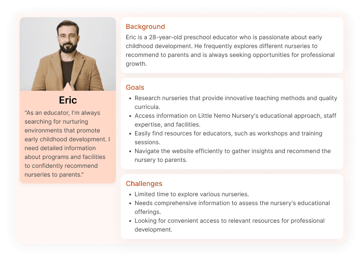
I created personas (Parent Paula and Educator Eric) by combining research and user understanding. These personas ensured user-focused design decisions, informed content placement, and efficient communication. They guided testing, aligned client expectations, and led to a user-centric redesign that improved engagement, relevance, and usability for Little Nemo Nursery's target audience.
I created personas (Parent Paula and Educator Eric) by combining research and user understanding. These personas ensured user-focused design decisions, informed content placement, and efficient communication. They guided testing, aligned client expectations, and led to a user-centric redesign that improved engagement, relevance, and usability for Little Nemo Nursery's target audience.
Develop Phase
Develop Phase
We used card sorting to involve users in structuring content and navigation for the Little Nemo Nursery website. Participants grouped and labeled content items based on their intuition. The impact was a user-centric information architecture that aligns with users' mental models, enhancing navigation, improving engagement, and creating a more intuitive browsing experience.
We used card sorting to involve users in structuring content and navigation for the Little Nemo Nursery website. Participants grouped and labeled content items based on their intuition. The impact was a user-centric information architecture that aligns with users' mental models, enhancing navigation, improving engagement, and creating a more intuitive browsing experience.

Information Architecture
Information Architecture
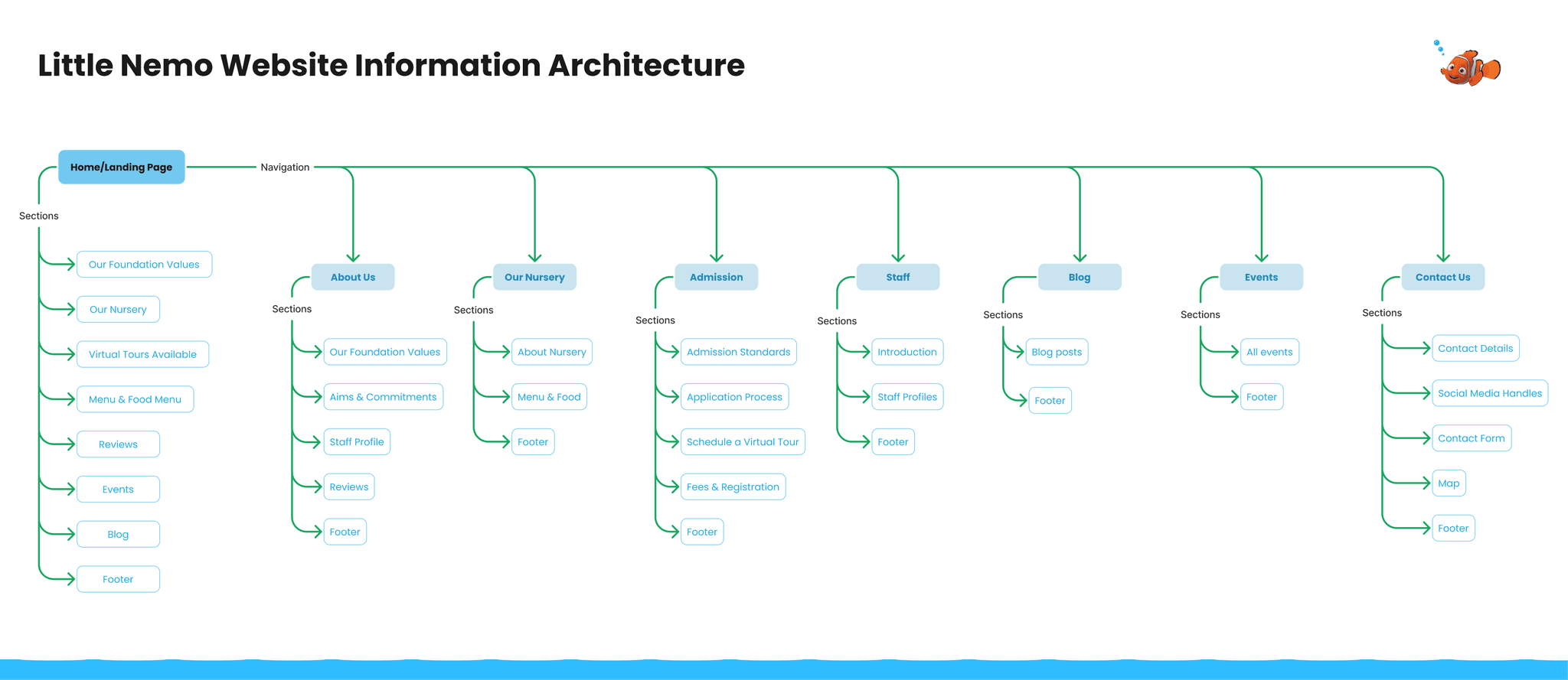
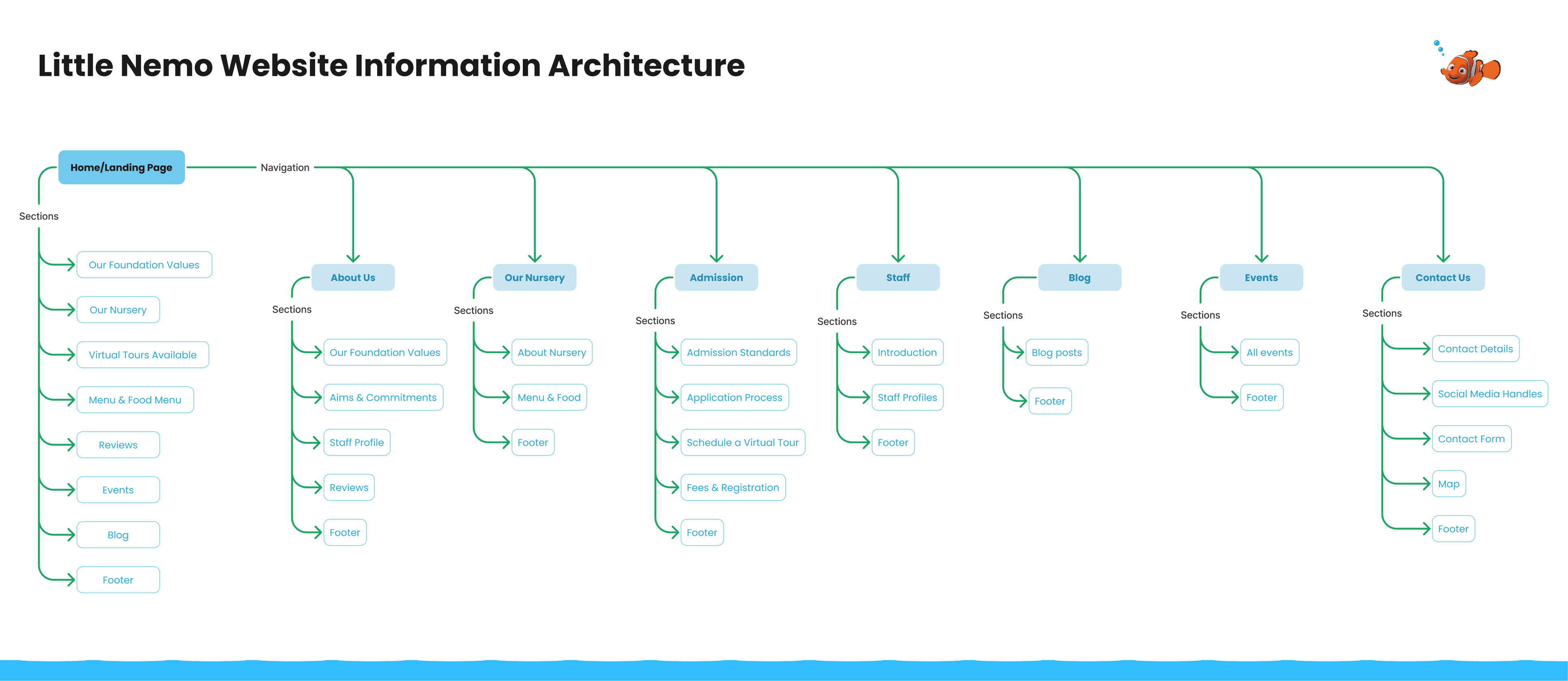
With insights from the card sorting sessions, I revamped the information architecture by organizing content based on users' mental models. This resulted in a more intuitive navigation structure, clear and logical content grouping, and user-friendly menu labels.
With insights from the card sorting sessions, I revamped the information architecture by organizing content based on users' mental models. This resulted in a more intuitive navigation structure, clear and logical content grouping, and user-friendly menu labels.
Low-Fidelity Wireframes
Low-Fidelity Wireframes
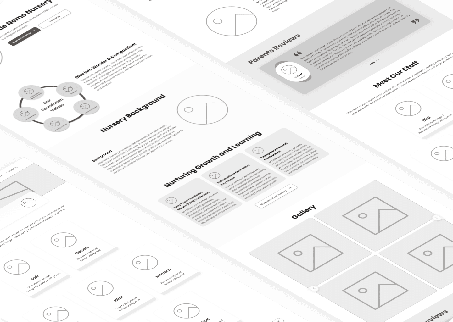
I created low-fidelity wireframes by translating the new information architecture into simplified, sketched layouts. These wireframes captured the organized content structure, clear navigation labels, and essential sections. The focus was on maintaining consistency, hierarchy, and mobile responsiveness while visually representing the improved user experience of the redesigned Little Nemo Nursery website.
I created low-fidelity wireframes by translating the new information architecture into simplified, sketched layouts. These wireframes captured the organized content structure, clear navigation labels, and essential sections. The focus was on maintaining consistency, hierarchy, and mobile responsiveness while visually representing the improved user experience of the redesigned Little Nemo Nursery website.
Brand Style Guide
Brand Style Guide
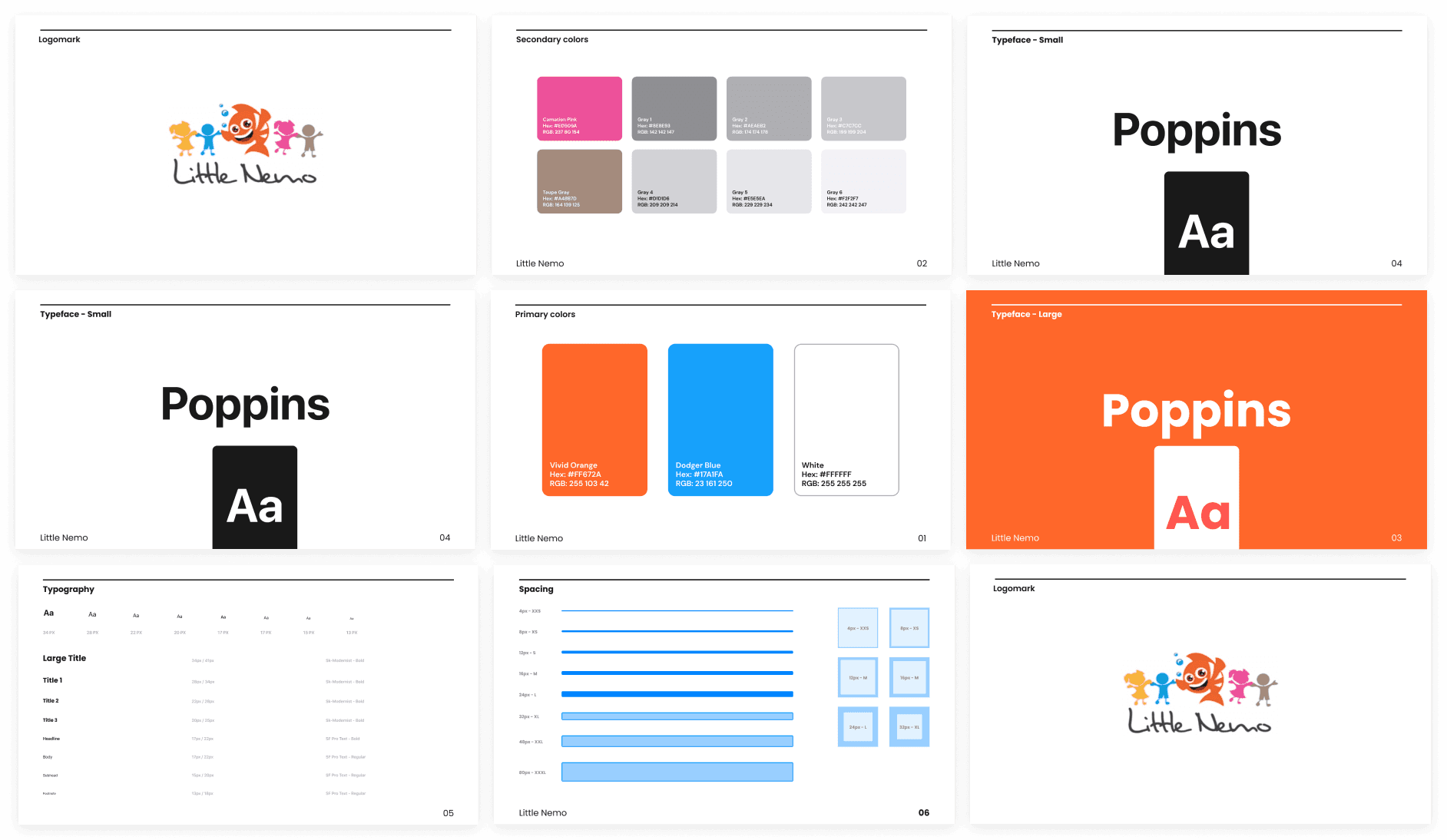
I created a brand style guide for this project to establish consistent visual and design elements. This guide ensured cohesive branding across various touchpoints, fostering recognition and reinforcing Little Nemo Nursery's identity. The impact was evident in improved brand consistency, elevated professionalism, and streamlined design decisions, resulting in a unified and visually appealing online presence that resonated with the target audience.
I created a brand style guide for this project to establish consistent visual and design elements. This guide ensured cohesive branding across various touchpoints, fostering recognition and reinforcing Little Nemo Nursery's identity. The impact was evident in improved brand consistency, elevated professionalism, and streamlined design decisions, resulting in a unified and visually appealing online presence that resonated with the target audience.
High Fidelity Web Designs
High Fidelity Web Designs
Based on user and client feedback, I refined the low-fidelity wireframes by incorporating detailed design elements, realistic content, and interactive features to create a high-fidelity prototype. This prototype visually showcased the improved information architecture, enhanced navigation, and user-friendly experience of the redesigned Little Nemo Nursery website, offering a comprehensive preview of its final look and functionality.
Based on user and client feedback, I refined the low-fidelity wireframes by incorporating detailed design elements, realistic content, and interactive features to create a high-fidelity prototype. This prototype visually showcased the improved information architecture, enhanced navigation, and user-friendly experience of the redesigned Little Nemo Nursery website, offering a comprehensive preview of its final look and functionality.

High Fidelity Mobile Designs
High Fidelity Mobile Designs
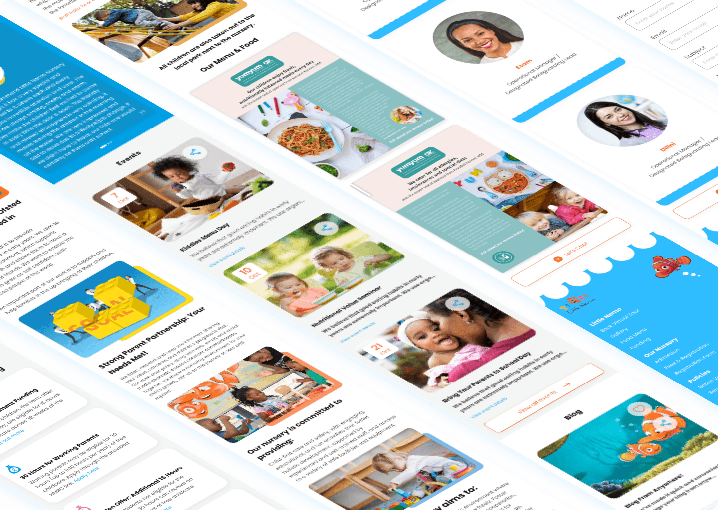
Upon completing the high-fidelity web prototype, I entrusted the task of adapting the design for mobile responsiveness to a supporting designer. I provided guidance and feedback throughout the process, ensuring that elements were appropriately resized and repositioned, typography adjustments were made, and touch-friendly interactions were refined. Consistency was maintained through regular communication and iterative reviews, resulting in a high-fidelity mobile prototype that upheld the user-centric design and seamless cross-device experience of the Little Nemo Nursery website.
Upon completing the high-fidelity web prototype, I entrusted the task of adapting the design for mobile responsiveness to a supporting designer. I provided guidance and feedback throughout the process, ensuring that elements were appropriately resized and repositioned, typography adjustments were made, and touch-friendly interactions were refined. Consistency was maintained through regular communication and iterative reviews, resulting in a high-fidelity mobile prototype that upheld the user-centric design and seamless cross-device experience of the Little Nemo Nursery website.

Deliver Phase
Deliver Phase
In the Deliver phase, I transformed the existing interface by:
Redesigning layout with a clean, spacious design
Implementing a modern color palette and typography
Introducing clear visual hierarchy and responsive design
Incorporating engaging imagery and icons
Enhancing usability through streamlined navigation and clear calls-to-action

Before
Before

After
After


Responsive Mobile
Impact
Impact
Usability Improvement: The redesign addressed usability issues, resulting in an intuitive information architecture and improved navigation.
Enhanced Visual Appeal: Aesthetic enhancements, such as modern typography, imagery, and color palette, elevated the website's visual appeal.
Responsive Design: Ensured mobile responsiveness, providing a consistent experience across devices.
Clear Calls-to-Action: Strategic placement of prominent calls-to-action increased user engagement and conversion rates.
Engaging Interactions: Integration of interactive elements enhanced user engagement and provided a dynamic browsing experience.

Results & Outcome
Results & Outcome
The redesign of the Little Nemo Nursery website yielded significant improvements in both user experience and visual appeal. By implementing a user-centric approach and revamping the information architecture, the following outcomes were achieved:
Enhanced User Engagement: The streamlined information architecture and intuitive navigation led to increased user engagement, as visitors could effortlessly access relevant content and interact with key features.
Reduced Bounce Rate: The clear and organized layout minimized confusion, resulting in a noticeable reduction in the bounce rate as users were more inclined to explore multiple pages.
Improved Conversion Rate: The revamped enrollment process, supported by informative program details and simplified forms, contributed to an improved conversion rate for inquiries and applications.
Positive User Feedback: Usability testing and feedback sessions revealed that users found the new design significantly more user-friendly, praising the ease of locating information and the attractive visual presentation.
Challenges Overcome: Despite the successful outcomes, some challenges were encountered during the redesign process:
Content Prioritization: Balancing the extensive content of a nursery's website required careful consideration to ensure that essential information was highlighted while maintaining a clean design.
Mobile Responsiveness: Adapting the design for mobile devices demanded meticulous adjustments to optimize layout and interactions for smaller screens.
Client Alignment: Ensuring the client's vision aligned with the design direction required effective communication and multiple iterations to reach a cohesive outcome.
Client Satisfaction: The client expressed genuine satisfaction with the redesign, applauding its user-centered approach, improved clarity, and aesthetics. They specifically appreciated the hero section's transformation, which now encapsulates the nursery's essence and values. The client's enthusiasm and endorsement culminated in the successful handoff of the design to the development team. The redesigned Little Nemo Nursery website is poised to provide an exceptional online experience that reflects the nursery's commitment to child development and serves as a valuable resource for parents and guardians.